
Print Projects
Direct Mail
Client: Fox School of Business
Project type: Die-cut Pop-up Mailer
As part of the university’s marketing initiative, I designed an engaging pop-up mailer inspired by Hooter, Temple University’s mascot. The piece was sent to accepted graduate students as part of a coordinated direct-mail campaign. My focus was on creating a playful, memorable experience while maintaining strong visual consistency across all components, including the pop-up owl, the accompanying postcard, and the branded envelope. Together, they form a cohesive set that reinforces school spirit and elevates the overall campaign impact.
Signage

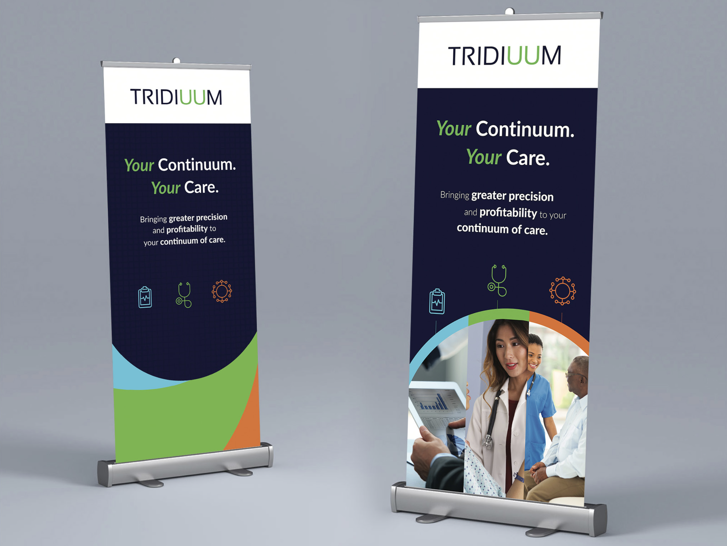
Clients: SICOM and Tridiuum
Project type: Floor standing banner
At Vovéo Marketing Group, I designed two floor-standing banners (23.5” × 80”) for SICOM and Tridiuum—distinct brands operating in the restaurant technology and behavioral health sectors. Leveraging my familiarity with each visual identity system, I developed clean, high-impact designs optimized for event visibility and brand cohesion. I managed the project from initial concept through final print production to ensure accuracy, consistency, and a polished finished product.
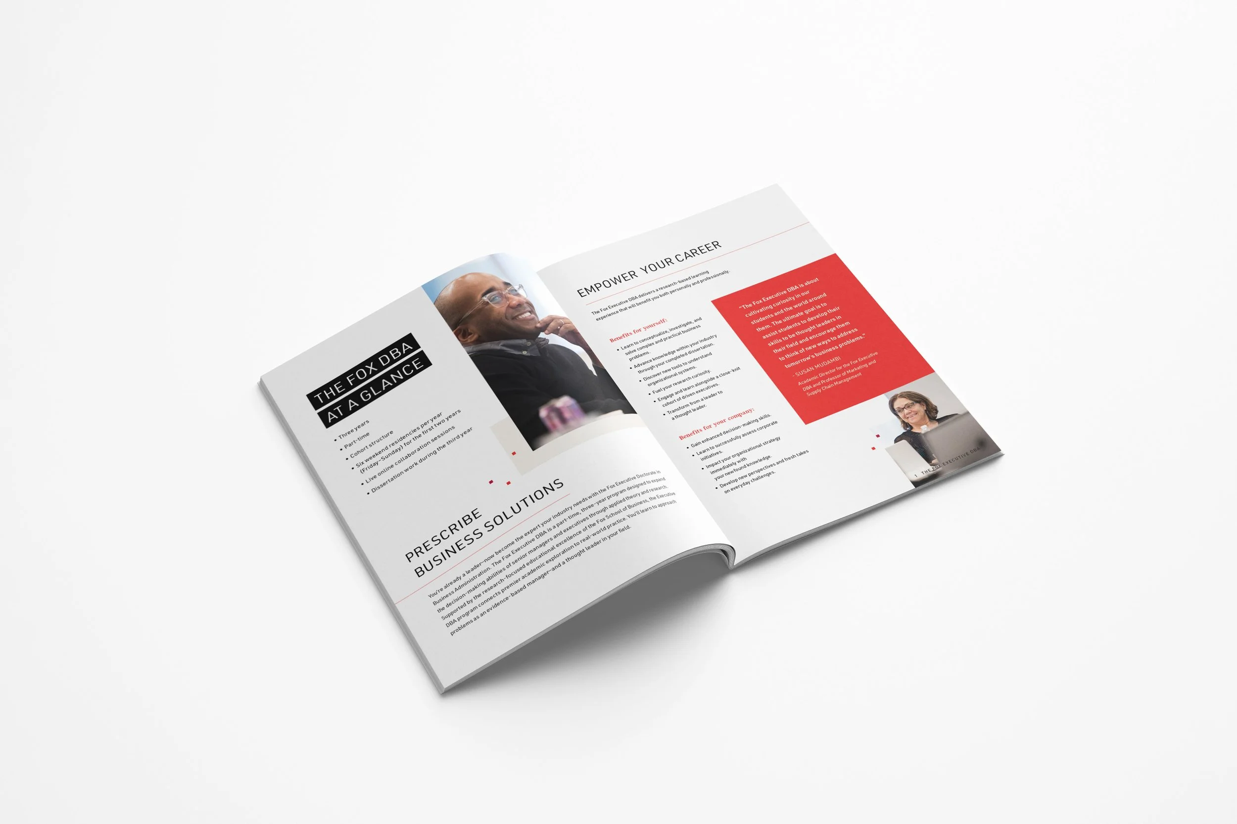
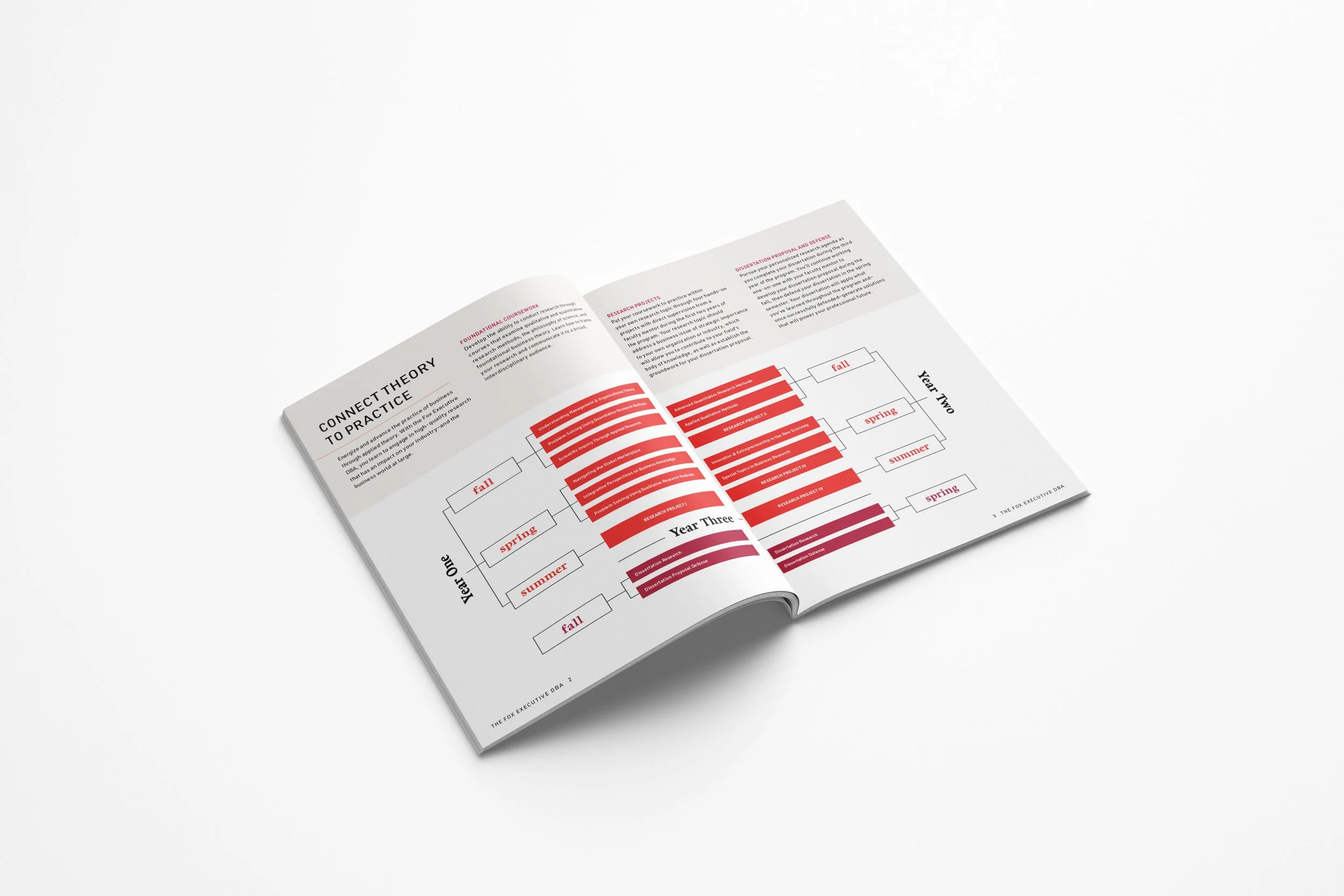
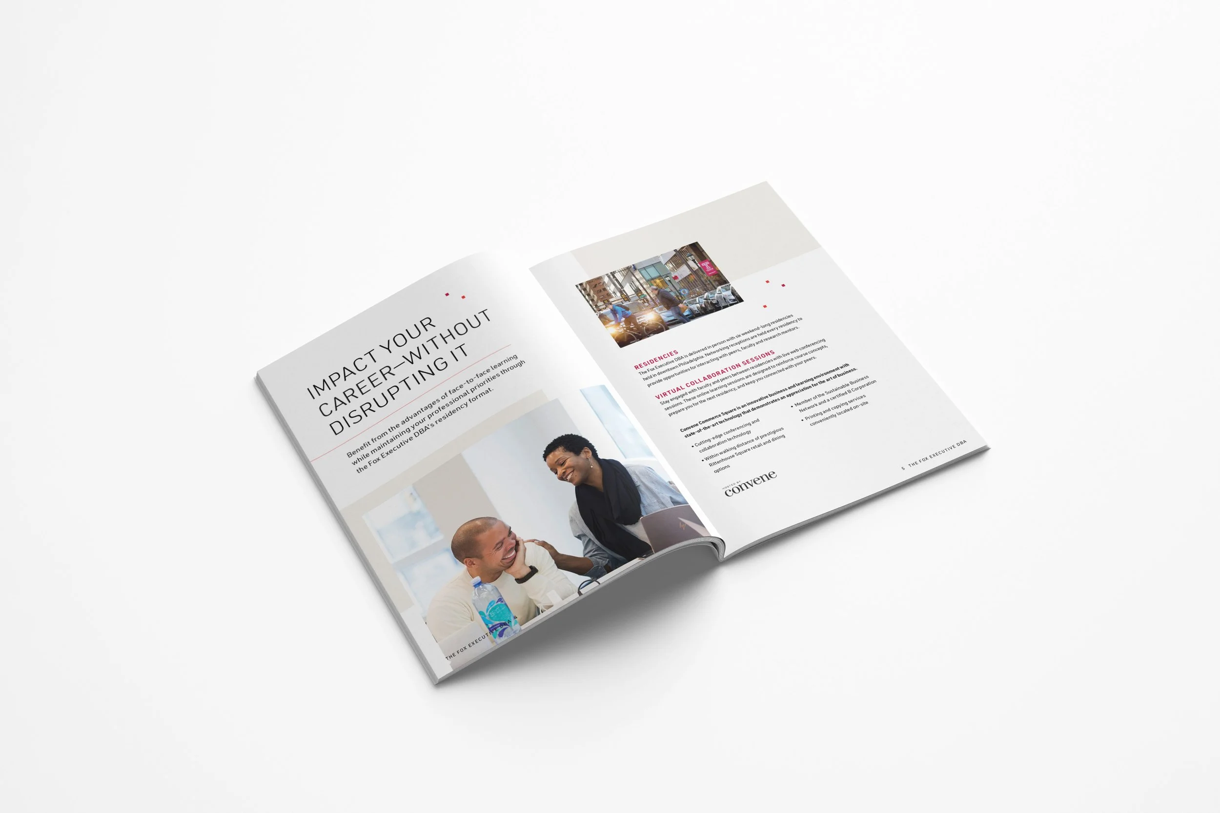
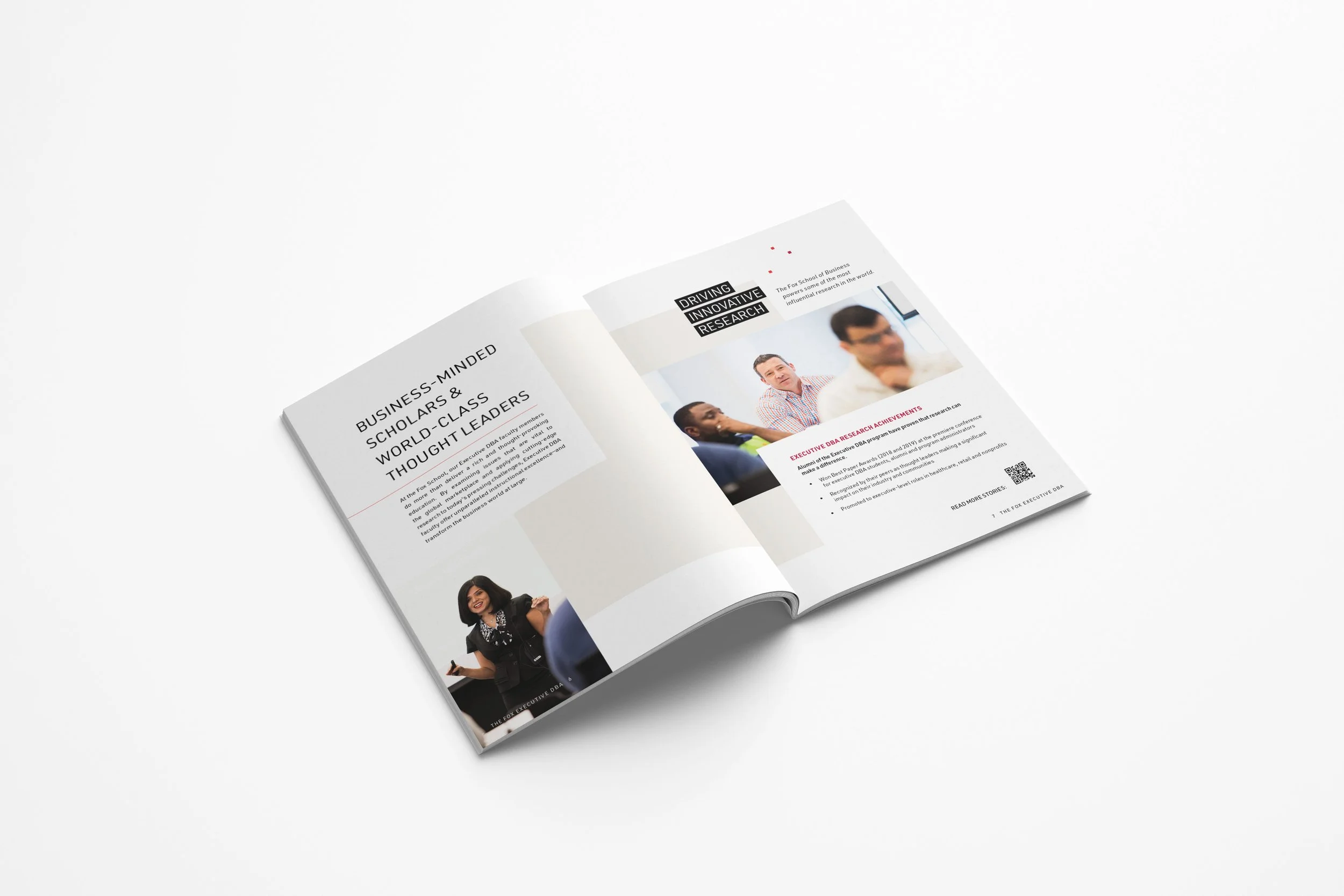
Brochure


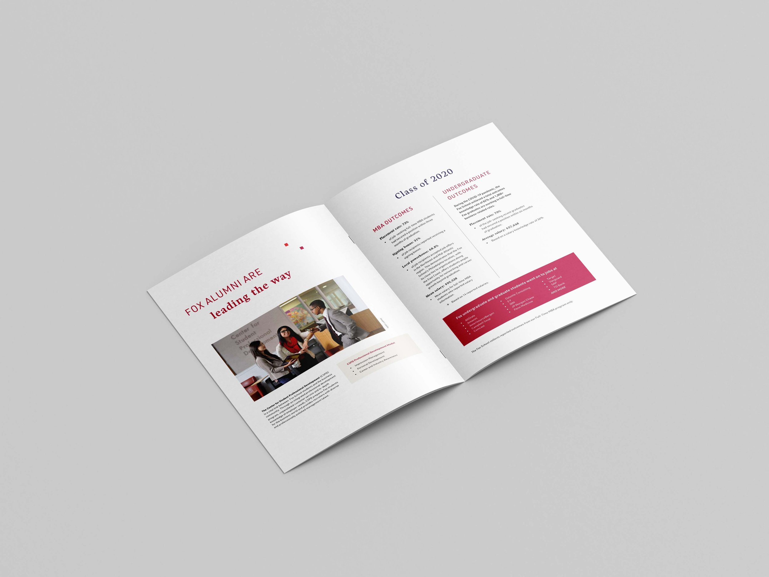
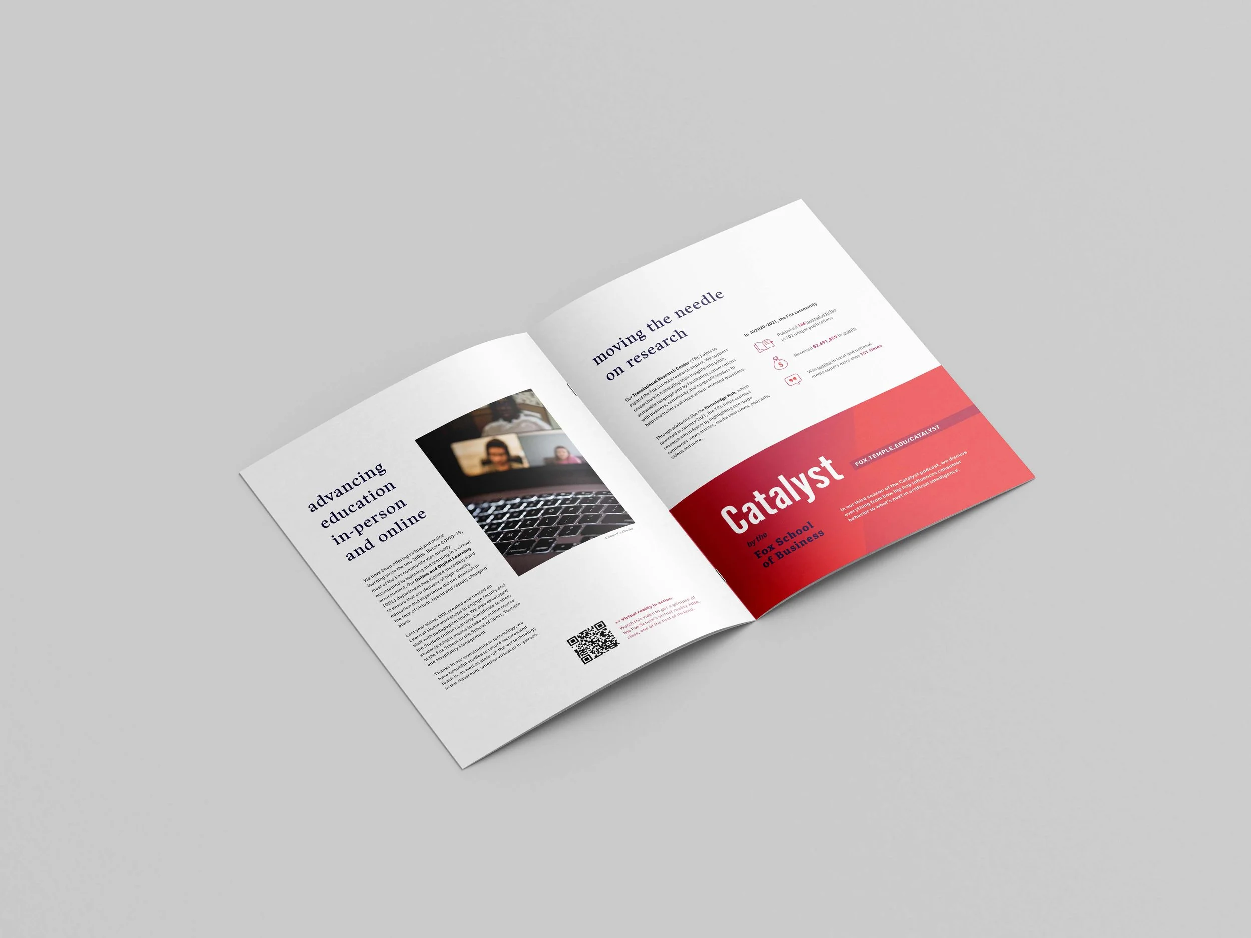


Client: Fox School of Business
Project type: Bi-fold Brochure
I design Fox’s annual State of the School brochure, a key communications piece distributed to internal and external stakeholders, alumni, parents, and donors. The publication highlights student outcomes, faculty achievements, and the school’s overall financial performance. My role includes shaping a clear, engaging visual narrative that supports transparency, reinforces brand credibility, and effectively communicates the school’s progress year over year.
Out-Of-Home


Client: Temple University’s School of Tourism and Hospitality Management & Fox School of Business
Project type: Static Vinyl Billboards
These static billboards ran along I-95 and I-76 as part of our annual brand-level advertising campaign, helping each school stay top-of-mind during recruitment season. The designs were developed to seamlessly align with broader digital and print materials, ensuring a cohesive visual presence across all touchpoints.
Each billboard reflects its respective brand’s unique visual strategy—STHM leverages bold, immersive imagery to capture attention, while Fox relies on its signature brand textures, typographic creativity, and message-driven design. Together, they reinforce brand recognition and support the overarching campaign narrative.
